Saturday, September 20, 2014

Thoughts on the Unheimliche

I am continuing with the ideas of distorted interior space based in part on Freud's essay The Uncanny where he discusses the German word Unheimliche, the opposite of heimlich which means familiar, native or belonging to the home. By including familiar images such as book shelves, walls, floor and cabinets I am including the familiar. But by rendering these in a rough, cartoon like and generally non realistic fashion I am beginning to flirt with ideas of fiction and the uncanny as well as the distortion of the familiar. At least that is where my thoughts lie at the moment. 

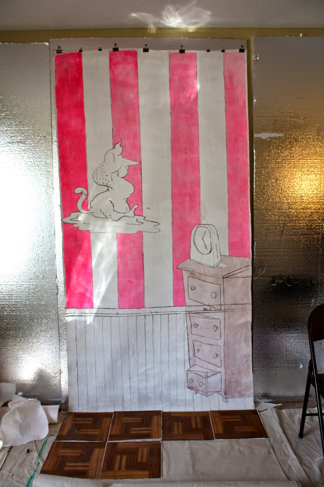
In this newest piece (still in progress) I have enlisted previous imagery which now serves as odd some what active wall paper. I am now calling these amorphous shapes "invaders", they were once friendly cartoon shapes to my understanding but after several semesters of work I realize they are not friendly, but rather signify disease and distortion. 

I feel like many ideas from the previous semesters of school are beginning to converge, and much of this has to do with Freud's The Uncanny the focus of my second research paper. I am exited by these new works but at the same time I realize there is more to be considered. 

This latest piece, I created on the floor of my living room, only to hang it on the wall and realize it is too large to fit on the wall of my studio! Where the books are at the bottom is where the floor should begin. Luckily I will be moving into a new studio with in the next week or so which, if I remember correctly has one wall large enough for me to work on this piece on the wall! 
Created on the floor 


fleshy pink color added to the "wall" of the piece

The books should be where the floor begins if hung correctly 

The Invaders
I think another coat of pink is necessary 


Monday, September 15, 2014

Tiny Rooms and Pink Walls . . . .


Moving from small back to BIG! 

I had a great intro conversation with my new mentor who suggested it was time to really dig into the work. He was interested in the idea of the room/interior space I have been working with so far this semester and suggested paintings or even to think about them in terms of real space. As the work I came into the program was installation based I feel this may be an opportunity to come back to where I started with a more in-depth understanding of my work and what my main concerns are.

I am currently continuing with creating small collages that may become large installation pieces. My newest work in progress is created on a 15ftx4ft tarp. This first piece is experiment and exploration. I feel in the next piece I need to add several more layers of gesso to create a richer less dry texture to work on, I am also considering more vibrant colors. I will also play with different types of flooring!

This feels like an exiting next step! I am looking forward to creating more in this vein. 


Wednesday, August 27, 2014

Size Small

Along with delving deeper into research this semester the other major comment I received at the last residency was to find a way to make my lines more unique and less uniform. I created many simple sketches using ink droppers rather than an pen or brush, I am now adding collage elements into them.

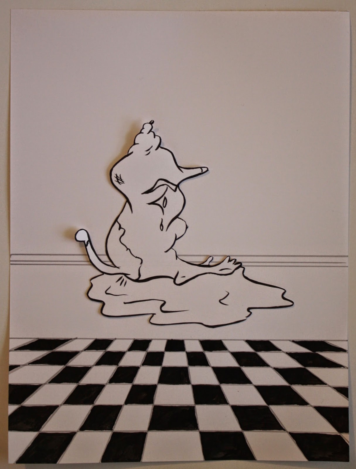
I am also continuing with the idea of the double or in this case multiple interior spaces.

These drawings are all 8x10in - once again the first part of my semester is dominated a small scale.


Friday, August 22, 2014

Reading, Reading, Reading

This semester thus far has been occupied with a great deal of reading, which I have discovered seems to be my norm when beginning a new semester. I have been reading:

The Bell Jar - Sylvia Plath
Dracula - Bram Stoker
The Uncanny - Sigmund Freud
The Sandman - E.T.A. Hoffmann
Wonderful Blood: Theology and Practice in Late Medieval Northern Germany and Beyond - Bynum, Caroline Walker
Powers of Horror: An Essay on Abject - Julia Kristeva

Until yesterday the readings I have been doing seemed interesting but separate, suddenly after two days of consecutive and extensive reading things started to converge. It is becoming clear that I am interested in Perceptions of Reality. A Short list/very brief examples of some connections found thus far . . .

Freud's Uncanny - Individuals may perceive the uncanny based on their own experiences/personality/perceptions.

The Sandman - The uncertainty the reader feels between what is reality and what is a fabrication in the mind of the main character.

Wonderful Blood - In Blood based miracles such as in Wilsnack (one of the most famous cult sites in Europe due to three miraculous hosts which survived a devastating fire and appeared to have the blood of Christ on them) it is difficult to prove such miracles, which raises questions of wether the miracle ever took place, can it ever be proven, or if it took place in the mind of the man who saw it.

I am slowly making my way through Powers of Horror and will perhaps find if it to ties in to ideas surrounding perceptions of reality.

I recently re-watched my favorite movie The Shining and as always was struck by the inside angles of the Overlook Hotel. In a print created in undergrad I played with the image of a fictional room in slightly distorted head on perspective. I began to make several of these drawings as "backgrounds" or "stages," places for future action to take place. In creating the same background over and over again (through drawing not print) I am exploring (however loosely) ideas associated with Freud's uncanny - the idea of the double or doppelgänger as well as the idea of a spontaneous return to the same location through different means.

These are in very beginning stages as I intend to cut out the painted shapes from the Mylar. I am wondering as always do they need more. I feel that they are missing the layer of drawn cartoon, or perhaps that the room needs more detail or to be painted. . . .


En experiment possibly too referential or simplistic or even too close to my earlier work. 

The following images were created on the new paper discussed in my last post which is made out of stone. I find them interesting and like that I have the potential to draw right into them or cut them out. However I miss being able to turn them over and see a new dimension on the other side. 


Monday, August 11, 2014

New Semester New Experiments


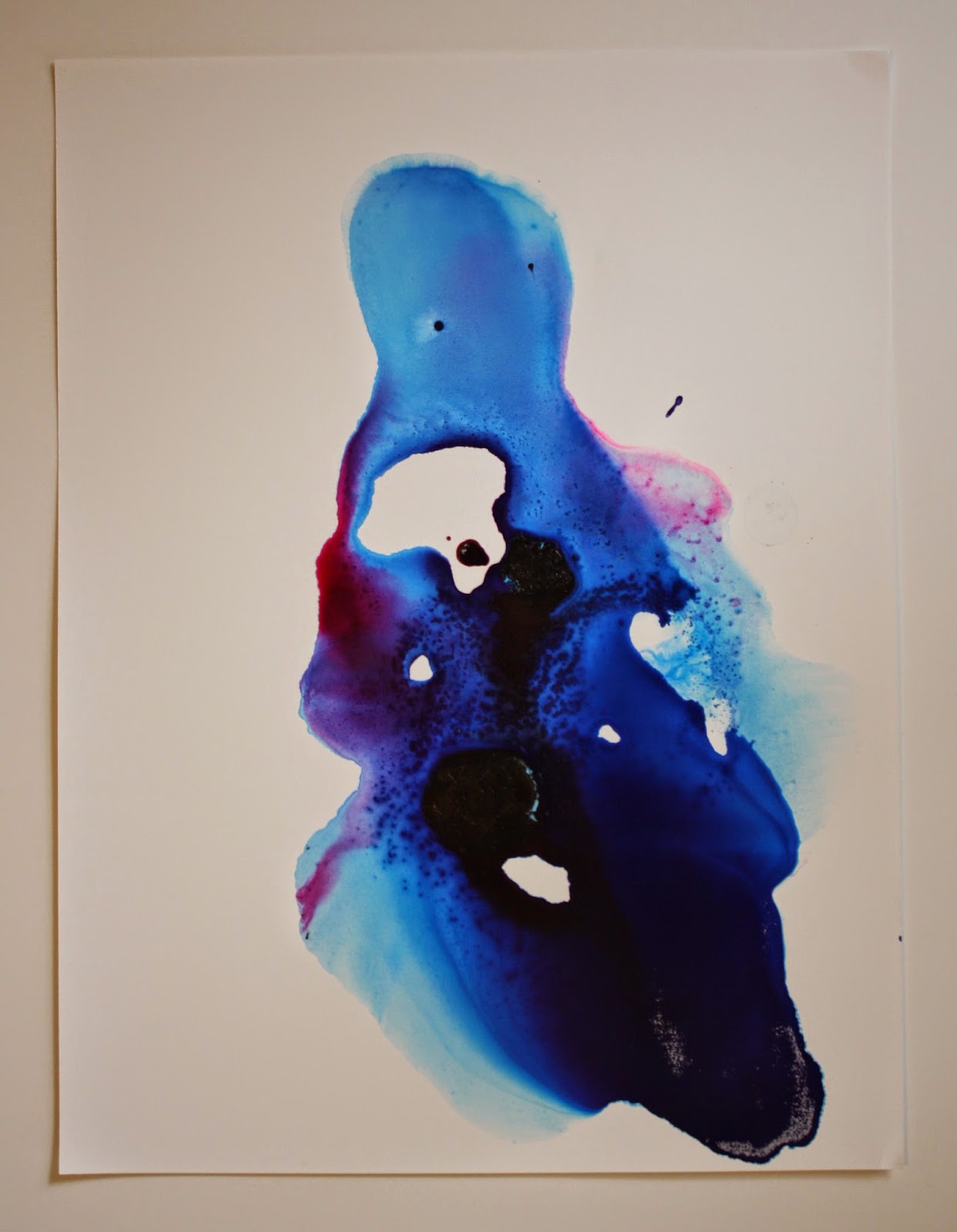
A fellow M.F.A. candidate recently recommended trying this alternative type of paper made of stones. The ink, water and other materials are not absorbed into it allowing for similar effects to my previous works on mylar. The benefit is that I am able to draw on top of and under the paint. These are some initial experiments with the new paper.


Involving figurines in work is something that I have wanted to try out for a long time, here are two experiments with pouring ink and enamel with toys from my childhood. 


Wednesday, July 23, 2014

You Can't Make Pink With Out Red . . . .


“You can not make pink with out red.”
This simplistic yet important quotation from a fellow student stands out as a bridge from my work last semester, concerning femininity, cartoon imagery and a heavy dose of pink, and my work this semester, which has veered down a darker road in content and value. This semester’s studio work was based around a single image, the chest tube connected to my mother. I was unsure how these very personal works would be received. The work I brought to this residency can be divided into three main sections; photographs of experiments with bubbles, abstract works on Mylar created with paint, ink and various non traditional art materials and third, a collaboration between cartoon inspired drawings and abstract cut outs of Mylar. The responses were overall very positive.
The bubble photographs received very positive responses early in the residency. They were described as remarkable and as having the ability to stop you in your tracks. Comparisons included nipples, bruises, cancer cells and pubic hair. The more abstract photographs were seen as stronger than ones easily decipherable as bubbles, which I agree with. While some felt that the bubbles stood strongly on their own, others felt that they did not fit in with the rest of my work.  Generally it was agreed that I should continue with these experiments as a side project, as they may become a resource or come to inform future work.


The Second category of work consisted of abstract works on Mylar created with paint, ink, and many other non-traditional materials. These works were based directly off of the image of a chest tube. My main question about these works was whether or not they could stand on their own or if something was missing. The majority of feedback warned of generic looking pours and a large history of female painters involved with pours. If I am to use pours in my work they must be unique to me. Other feed back included the installation of the pieces – that the Mylar should be farther from the wall to create larger shadows, or that the Mylar should be closer too the wall to make the work more substantial and less fragile. I was also warned about making work that is purely cathartic. However the general thought was that these pieces were a necessary step in my process.

            The third and best-received sections of work were the cartoon style drawings and cut outs of the poured paint and ink on Mylar. These were seen as the most interesting and to hold promise potential. It was recommended that I create a tension between the drawing and the Mylar allowing the cartoon to enter into the pour and the pour into the cartoon. The central placement of the image on the white paper background was seen by some as too graphic but others felt it worked well, Deb Todd Wheeler pegged this (white background and central image) as my “go to move” and encouraged me to try other solutions for backgrounds. She suggested taking photographs of textures in the outdoors and using those as a place for drawings and paintings to take place on.
            The small and intimate scale of these pieces was seen as a reflection on intimate relations between family members in difficult situations. Perhaps the most poignant comment concerned the quality of my line. It was said to feel generic and borrowed rather than my own unique line, that my work must to be more than just well drawn. I need to personalize the formal language further. This is something I will work on specifically this semester.
             The question “why all the red” came up several times over the residency. I explained that the work was based on blood, this lead into many interesting conversations about blood, particularly in a religious sense. Religion has always been a part of my life but I never thought about it in terms of art previously. Religious relics were discussed as well as the idea of my mother’s blood as a relic. Blood is seen at once holy and impure.  My decision to represent only the “squishy splat” parts of the body was also discussed, as was the notion about the body fragmented. Tony Apesos questioned my choice to represent my mother’s body fluids rather than create a portrait of her. It does seem an odd focus in retrospect. One person suggested creating stand in reoccurring characters for my mother and I.
            Surrealism was suggested as an avenue of research and exploration. The gesture towards meaning present in my current work was seen as not enough and that the work needs to become not formally complex but complex in its meaning. I also need to be clear about what I want to say and be able to verbalize this to a greater degree.
            Themes and ideas that were seen in my work by others include; mortal parents, childish wishful thinking, religious associates with blood, illness, vulnerability, death, sexy, beauty, the grotesque, danger and intimacy, sexy and the disgusting, violence, abjection, elegance and the unconscious. 
            Over the coming semester I plan to work on the quality and nuances in my drawings and lines. Suggestions include letting lines be blurry, dissolving lines as well as adding scratches and marks. The addition of printmaking to the drawings and pours was suggested, even creating rubber stamps out of linoleum. I will continue with the bubbles as a side project, as this was the general consensus and see if leads to something interesting. Creating scans of the bubbles was another idea. I plan to explore different surfaces to work with other than the one shiny Mylar I used this semester possibly mirrors, Plexiglas and frosted Mylar. I will also experiment with different ways of installing the Mylar. Creating an installation was a suggestion echoed many times and installations have always been of great interest to me.


            Suggested readings for this semester include; Julia Kristeva Powers of Horror; An Essay on Abjection, Mary Douglas’ Purity and Danger; An Analysis on Concepts of Pollution and Taboo as well as Caroline Walker Bynum’s Wonderful Blood; Theology and Practice in Late Medieval Northern Germany and Beyond.

Artists suggested over the residency include; Arturo Herrera, Amy Cutler, Ken Price, Carrie Moyer, Carroll Dunham, Morris Louis, Ghada Amer, Paul Jenkins, Kevin Bake, Jacqueline Humphries, Helen Frankenthaler, Mark Ryden, Martin Wong Marilyn Minter, Maya Freelon, Kara walker, Annette Messager, Greg Thompson, Raul Gonzalez